Showing posts with label Timebank brief. Show all posts

Saturday, 4 June 2011

submitted boards

These boards were put on and handed in on my submission CD but I wanted to finish up by putting them up here as well. I had problems with issuu yesterday but should be working fine now.


Monday, 9 May 2011

Mid evaluation/run down on current status of briefs

This post is to look at where I currently am with my briefs, looking back at how things have changed since my statement of intent was written, and to outline some decisions made about the briefs that I havent blogged until now.

First up, my rationale:

'To produce Typographically driven, concept based visual solutions for layout and branding with a focus on print outcome'


Good news, I am pleased that this is still relevant and accurately describes the work I have been doing since I wrote it.


Now to a rundown on the current status of my briefs: (order as described in SOI)


1) Leeds creative Time-bank
Brief completed, this was the first one I finished this module so it seems a long time ago! I don't think I will re-visit this one as I achieved all I wanted from it.  As a pitch for a design direction it's a credible solution I feel.


2) Exhibitions brief
This brief is well underway and I am planning to finish it before the end of this week, I have an interesting design direction for each exhibition and I just need to push out the brief to explore "what can it be" (© Fred) 


3) Lights camera action (film posters brief)
This brief I started ages ago but it has stuttered to a halt unfortunately, its an ideas led brief and tragically I have had only one really interesting idea for it: the James Bond Goldfinger poster. Even this poster isn't really completed yet as I have some adjustments I want to make. The plan is to spend a day on this brief to finish the bond poster and print it and thrash out some more ideas. I would really like to get something good out of this but if nothing new comes from another day brainstorming then I will drop the brief as I cant afford to waste more time.


4) Its all too much (roses 2011)
This brief was always a stand-by, incase something more interesting didn't come in, but I have done some small live briefs instead of looking at this one, so its officially dropped now.


5) Calendar brief
Another brief currently underway, I hope to have something completed by the end of next week. Its been a long term brief, and although I feel I have some some interesting work for it, its still based around experimental and quite minimal layout and STILL lacks real world context so I get the feeling it wont meet many grading criteria unless I can quickly make much more out of it.


6) Creative Networks brief
This was a quick live brief (but not nearly as quick as it should have been!) with only a postcard as an outcome which wasn't really worth the time invested unfortunately. I could revisit this to push the brief out a bit but I would really prefer to leave it and put it down to experience. At least its a real world job, but I learnt more about client management than actual design doing this!


7) KTP brief
This is a brief that I should have never started, I think I felt compelled to do something for this because I went to a briefing to find out more and found there was only 3 of us in the briefing! To be honest I wasn't really interested in the brief, and the 'pack' as it was originally described to us is a longer term project in planning stages that wont be ready to print anytime soon. A week wasted, brief dropped.


8) 2020 perfect vision
A one week live pitch that came on the back of a week placement I did for the company. I pitched the DVD packaging as they asked, but I can see some ways to make this brief slightly bigger so I may revisit this before hand in to expand the scope of this. I think I have come up with quite a neat solution for this and taken existing branding in a new direction so I am pleased with this work even though its more commercial and client led job.


On the whole I am slightly concerned at the moment about the amount of work done, even though I know where and why the time went, I have been working on briefs (or on placement), just not always doing the right briefs quick enough!


Tuesday, 8 February 2011

Timebank final proposal boards and evaluation


Open publication - Free publishing - More paul mitchell


These are the two, A2 boards I submitted for this brief. Unfortunately Michael the timebroker didn't want to take my design any further. The reasons were he was looking for a new solution to how users will transfer time credits and interact with the back and my designs didn't tackle this aspect, being more of a traditional bank note. This is fair enough because early on I made a decision to propose an overall design direction and not to tackle the fundamental technical workings of the timebank. In the end I shaped the brief to explore a design direction that I was interested in so despite not winning the commission I am pleased I got out of it what I wanted.


Final notes, Click for Hi-Res


Timebank brief test prints

These are from various stages in the design process so its a bit of a jumble, it was a quick brief so i'm only catching up with the blogging now its done.


 Using my hourglass logo as repeat pattern, I used this on the buisness card back


Layout experiments, I wasn't sure which way the banner would look best and how to use the circle elements with this, there was a fair amount of trial and error

I though the logo would work something like this, but in the end I went with just using the hourglass graphic with plain text.


Printing tests of various colour ways and design refinements. I didn't want to spent so much time 'fiddling' with this design and that has been my downfall in the past, but can I never get designs looking decent first.. or 5th time unfortunately so tests are inevitable.

Timebank, expanding the brief

I made a conscious decision for this brief to be 'design led' rather than a concept driven solution. I wanted to create a design style that could be used over all the timebank publicity material, and not just the currency notes. To demonstrate how the graphical style i developed could be applied elsewhere I reapropriated elements from the note designs and created concepts for a website template, and also stationary and logo.


Card design back and front.


Two versions of a letterhead design


blank template for a website content.

Timebank brief illustrator vector work

I did all the design for this brief using Illustrator. I made vector graphics of the elements and layouts I had previously sketched and experimented onscreen with these to work up to test versions I printed and the final designs.


These were the first elements I made, I started experimenting with circular repeated shapes as this was an element o f the cictorian designs I was looking at and is also used on banknotes so I new it would work with the design style I was developing.


An early version of the note front design. 
The fonts are conqueror (which is available free via: http://www.fontsquirrel.com/fonts/aw-conqueror-carved ) and MetaPlus (which isnt). Conqueror is perfect for this style of design, Victorian without being silly and its so well made.


 Early test spread note front plus back and a logo idea as a banner that I didnt use in the end because it only works large, and when it is large it dominates all the other design.


More tests showing development of design and colour experiments.

Timebank brief sketchbook work/design roughs

I have a bad habit of not documenting roughs, mostly because I think they look scrappy and probably only make sense to me, but in the spirit of trying to do things a little different this module, here are the pics of my pad I use to generate design ideas. These are all for this time-bank brief and show the variation I thought about for the note layout, and the beginnings of the elements I took into Adobe illustrator to crate the vector graphics.


Timebank brief start + influences

For this brief I decided to do something more design let than I usually do, and more clearly influenced from designs I am currently looking at that I usually make, so its been an experiment in lots of ways.

I have been curious about Victorian styles of design and layout since I researched for my flatland brief last module. I didnt actually use the style for that brief so I decided to base this currency brief around experiments in this style of using typography and decretive elements, but used in a more modern way.

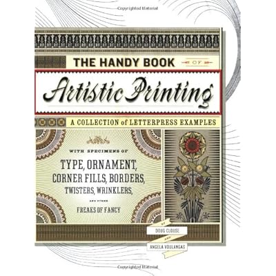
I found an excellent and intriguing book:


This has loads of original and sometimes bizarre type layouts, great stuff and very inspiring for me as it is so different from the usual designs I look at.

Some of my faves from the book:


I found the way the text was often arranged in banners interesting - this last one was a direct influence, I used the shape of this banner in my note designs

Wednesday, 26 January 2011

timebanking brief

I've just had a briefing with Michael Burkitt about the creative timebanking project, and it looks like its going to be an interesting brief. Timespan is 2 weeks for proposals so thats just about perfect to do some decent work without it taking up too much time.

Re-written brief: