I have been curious about Victorian styles of design and layout since I researched for my flatland brief last module. I didnt actually use the style for that brief so I decided to base this currency brief around experiments in this style of using typography and decretive elements, but used in a more modern way.
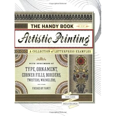
I found an excellent and intriguing book:
This has loads of original and sometimes bizarre type layouts, great stuff and very inspiring for me as it is so different from the usual designs I look at.
Some of my faves from the book:
I found the way the text was often arranged in banners interesting - this last one was a direct influence, I used the shape of this banner in my note designs


No comments:
Post a Comment